Geo-Spatial Data Visualization and Critical Metrics Predictions for Canadian Elections
 Geo Spaial Data Visualization
Abstract
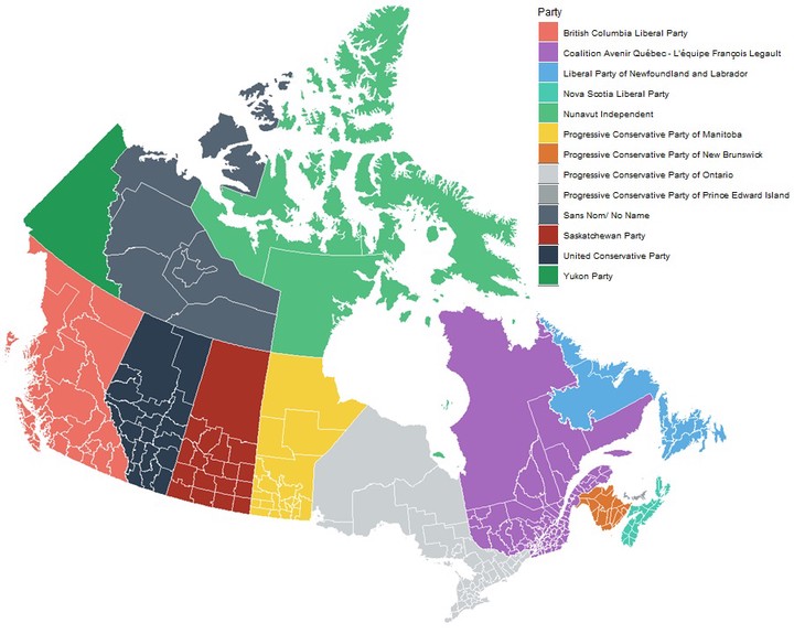
Open data published by various organizations is intended to make the data available to the public. All over the world, numerous organizations maintain a considerable number of open databases containing a lot of facts and numbers. However, most of them do not offer a concise and insightful data interpretation or visualization tool, which can help users to process all of the information in a consistently comparable way. Canadian Federal and Provincial Elections is an example of these databases. This information exists in numerous websites, as separate tables so that the user needs to traverse through a tree structure of scattered information on the site, and the user is left with the comparison, without providing proper tools, datainterpretation or visualizations. In this paper, we provide technical details of addressing this problem, by using the Canadian Elections data (since 1867) as a specific case study as it has numerous technical challenges. We hope that the methodology used here can help in developing similar tools to achieve some of the goals of publicly available datasets. The developed tool contains data visualization, trend analysis, and prediction components. The visualization enables the users to interact with the data through various techniques, including Geospatial visualization. To reproduce the results, we have open-sourced the tool.